01
Logo
Three marks, one light. The wordmark is the name, the icon is its b with the light switched on, and the lockup puts them together. Each carries one spark, never two.

baiden
baiden
Don't
baiden
 b
Download
Vector files, ready for print and screen.



02
Colour
Mostly light, a lot of Ink, and very little blue. Electric is the light in the dark, so it only works because it is rare: about one part in twenty.
Readable pairs
03
Type
One family, Host Grotesk, for everything. Big and tight for headings, calm and open for reading, small capitals for labels. Fourteen sizes cover the whole site; only the giant names and numbers sit outside them. Headings grow with the screen between a phone and a laptop, then stop.
Aa
Host Grotesk
Free and open (Google Fonts). Regular 400 for reading, Medium 500 for small text, Semibold 600 for headings, labels and buttons. No second font, no monospace.
ABCDEFGHIJKLMNOPQRSTUVWXYZ
abcdefghijklmnopqrstuvwxyz
0123456789 GH₵ $ € & ? !
Let's build yours.
Priced by scope.
Two clients came back.
What people say after launch.
Who am I hiring?
Starter site
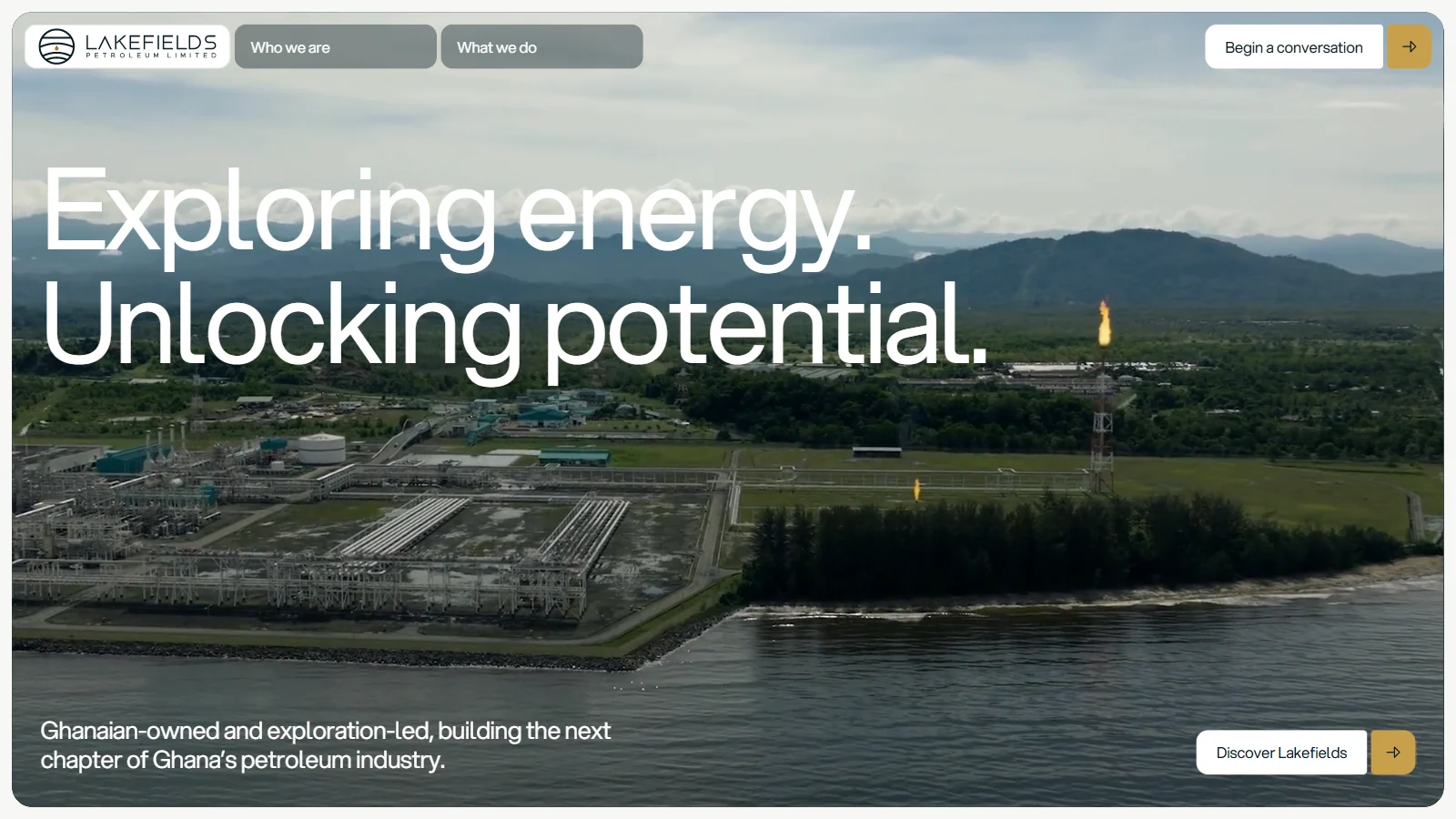
Lakefields Petroleum
Before anyone hires a web designer, they have questions.
I design and build sites for founders in Ghana and abroad.
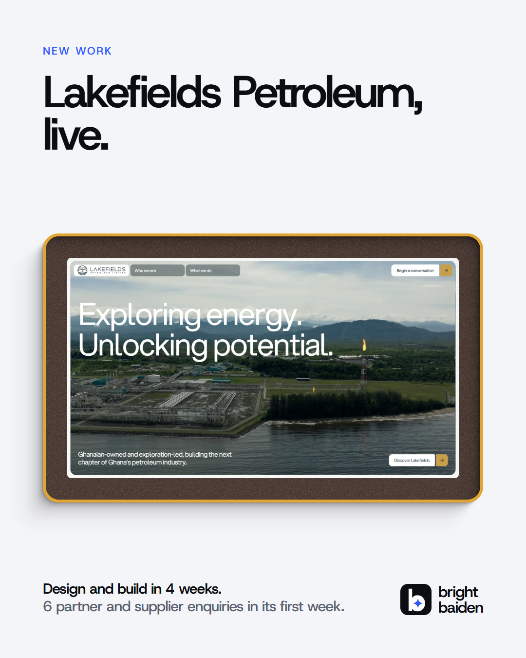
Six partner and supplier enquiries in its first week.
Get a quote
Live in 1 to 3 weeks
Accra, Ghana · At my desk
Brand guide
04
Layout
Full-width grounds, capped content. Backgrounds and dark plates run edge to edge; text and work stop growing at 1600 pixels and sit in the middle, so an ultrawide screen never pulls a line apart.
Spacing
Gaps step up in a fixed scale. Sections breathe at 72 to 170, blocks inside them at 24 to 48.
- 4
- 8
- 12
- 16
- 24
- 32
- 48
- 72
- 120
Corners
Round, never sharp. The bigger the thing, the bigger the corner.
- Pill · 999px
Buttons, the side switch, tags - Plate · 28px
Dark plates, the closing panel - Card · 22px
Tiles, cards, the footer band - Small card · 16px
Rows, chips with content - Detail · 10px
Swatches, small thumbnails
Breakpoints
- 390Phone One column. The nav goes to two rows.
- 720Large phone Side switch moves under the logo.
- 1000Tablet Section links come back in the nav.
- 1440Laptop The design size.
- 1600+Wide Content stops at 1600 and centres. Backgrounds keep going.
05
Light and motion
The light is the brand's signature: an electric beam that drifts across dark plates, like light falling into a room. Motion is quick and quiet. Things arrive fast and settle softly, and nothing moves just to move.
The light
A slow beam drawn live in the browser, the same one behind the hero, the closing panel and the quote form. It pauses when off screen, and holds still for anyone who asks for less motion.
Ease out
--ease-out · cubic-bezier(0.23, 1, 0.32, 1)Anything arriving or answering a tap: entrances, hovers, buttons
Ease in-out
--ease-in-out · cubic-bezier(0.77, 0, 0.175, 1)Things moving across the screen: the page-change cover, the hero window opening
Timing
- Button press160 ms
- Hover, colour changes200 ms
- Nav bar sliding in420 ms
- Page-change cover rising520 ms
- Section entrance900 ms
- Hero window opening1100 ms
- Electric light fading in1600 ms
Entrances
Each section rises 32 pixels and fades in as it enters the screen, a little before it is fully in view. The pieces inside follow 80 milliseconds apart.
Less motion. When a device asks for reduced motion, the light holds still, entrances appear without moving, the page change is instant and smooth scrolling is off. Nothing is hidden behind an animation.
06
Components
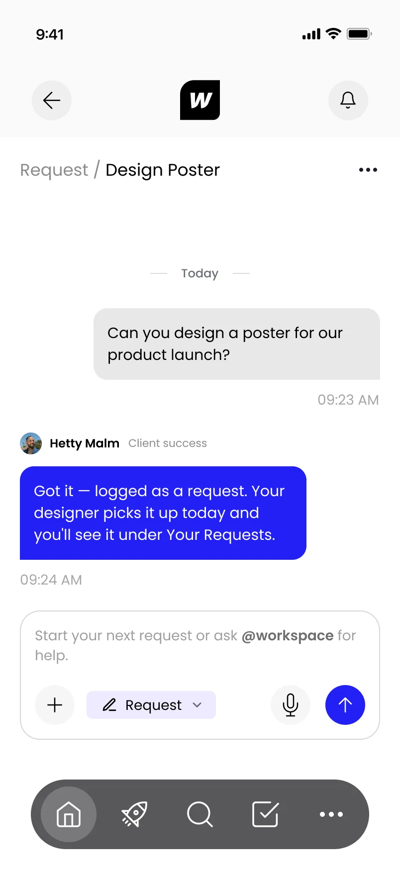
The parts every page is built from. These are the real components, the same code the site runs. Switch on Inspect to see their sizes, spacing and colours.
07
Imagery
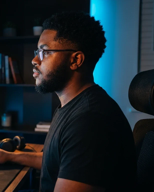
Two kinds of picture: Bright himself, in colour and in his own places, and the work, always shown as a finished thing on a holder. Never stock, never generated people.
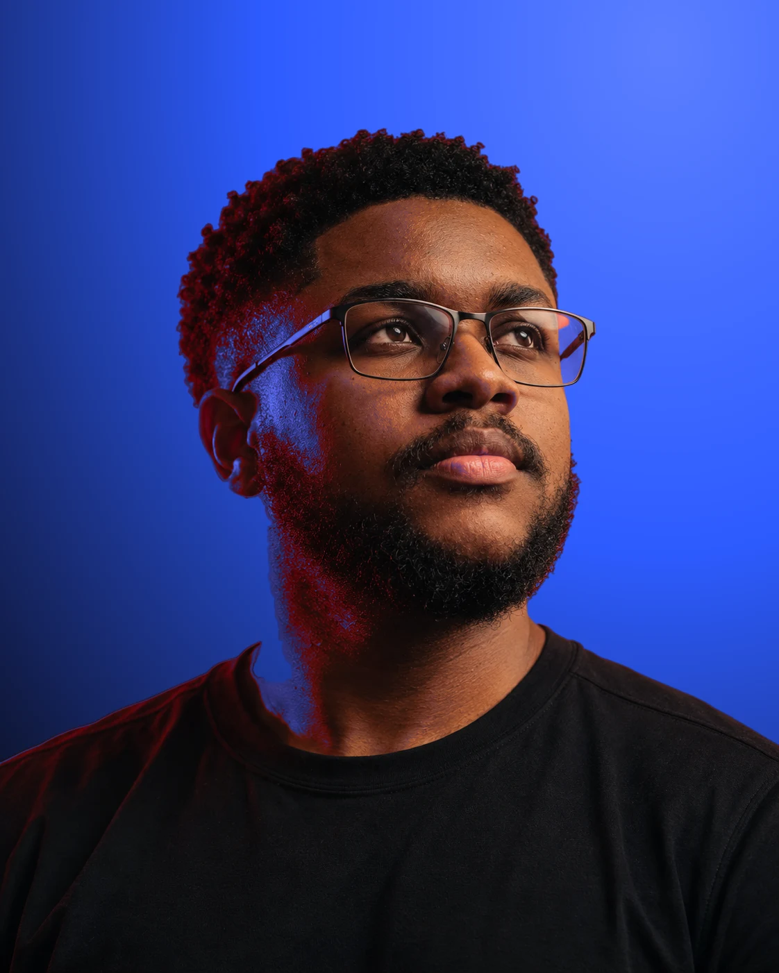
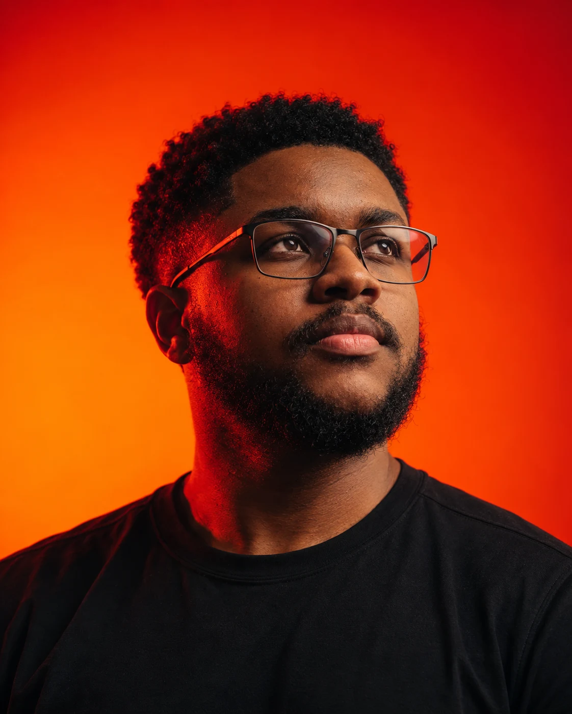
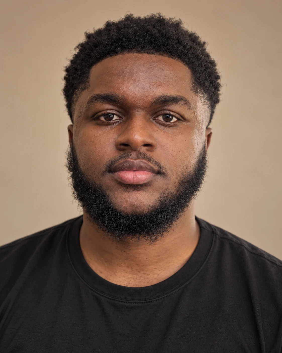
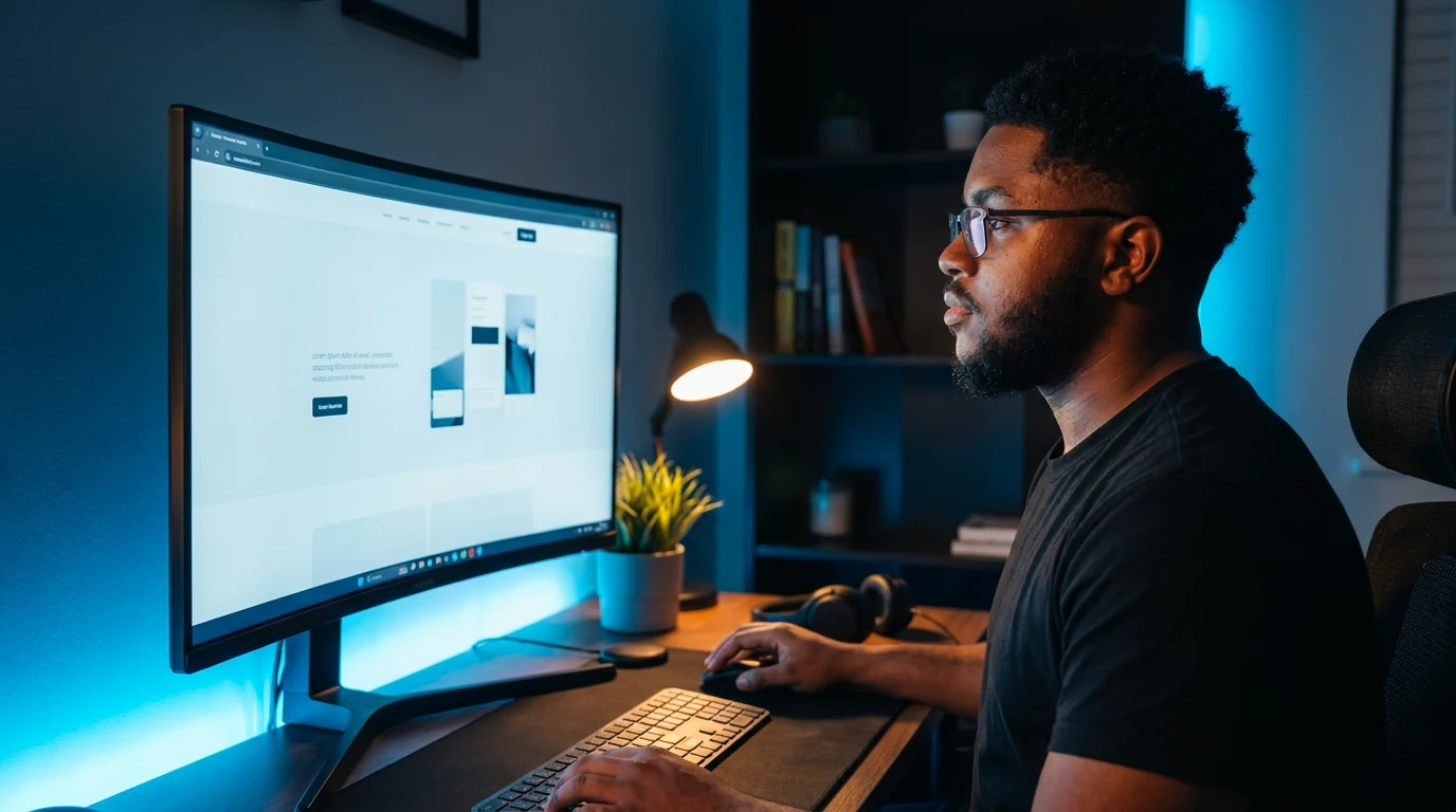
Rules, with the mistake shown
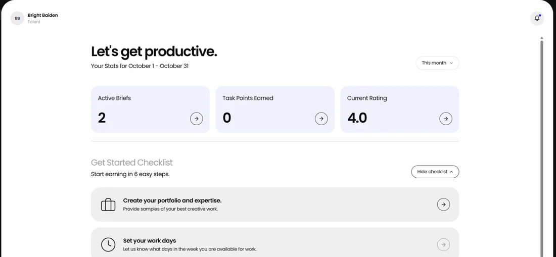
Client work
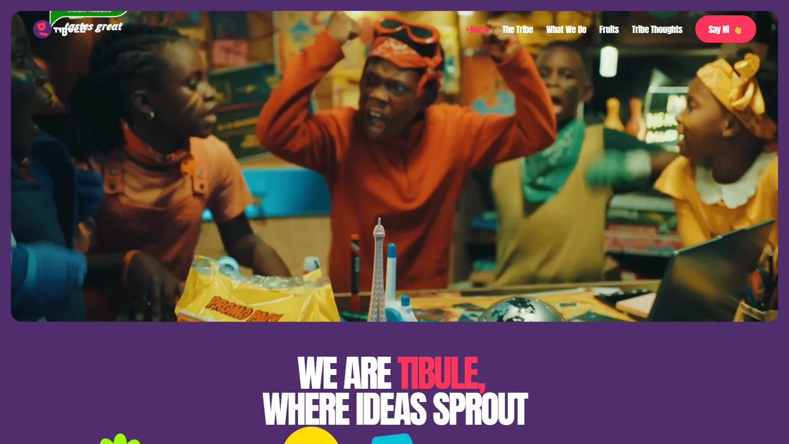
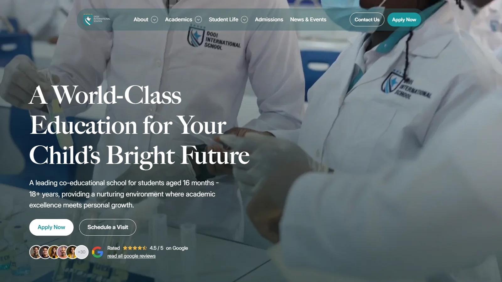
08
Voice
Bright writes the way he talks to a client on a call: plain, short and friendly. The words should sound like one person, because they are.
- 01Plain
Say it the way you would say it across a table. No jargon a client has to look up.
- 02Short
Two short sentences beat one long one. If a sentence needs a dash, it is doing two jobs.
- 03Specific
A number or a name beats an adjective. Weeks, enquiries, the client's own words.
- 04Warm, not loud
Friendly and calm. No hype, no exclamation marks, no promises that cannot be kept.
SayWebsites your customers trust on sight.
NotElevate your digital presence with cutting-edge web solutions.
SayPriced by scope.
NotCompetitive pricing tailored to your unique needs!
Say6 partner and supplier enquiries in its first week.
NotMassive growth in engagement and reach.
SaySmall fixes and tweaks like that are included.
NotSend me anything, anytime, and I'll handle it.
The small rules
- Headings
- Sentence case. Capital on the first word and on names only.
- Dashes
- No long dashes. Use a full stop, a comma, a colon or brackets.
- Numbers
- Digits, not words: 3 weeks, 6 enquiries. Ranges with “to”: 1 to 3 weeks.
- Person
- “I”, never “we”. Bright works alone and says so.
- Dates
- 27 Oct 2026. Money as GH₵ or $, never both in one line.
- Clients
- Named only with permission. Lakefields and Vertex Ridge are established firms: never present them, anywhere, as new, small or young.
Check a line
Paste a headline, a post or a message. It marks long dashes, hype words, exclamation marks and sentences over 25 words.
09
In use
The brand on the things people actually receive: the site, the first page of a proposal, the CV, a post, the line under every email. Each piece is the real file. Open any piece to see it close, or take the file.
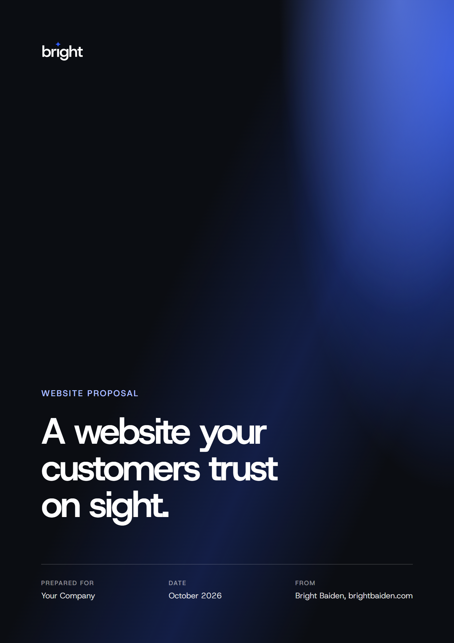

 | Bright Baiden Product designer · Accra, Ghana |
10
Social posts
Every post is built from the same parts: one of three blue grounds, the b, and one idea. The work always leads. When a post shows a screen, the b steps back into the ground.
The b, two ways
The solid b is for statement posts with nothing else on them, like "Apps and websites people actually use." below.
The set
Carousel
Rules